YEAR
2024
Type
Passion Project
Instagram: @seekthekingdom_co
DESCRIPTION
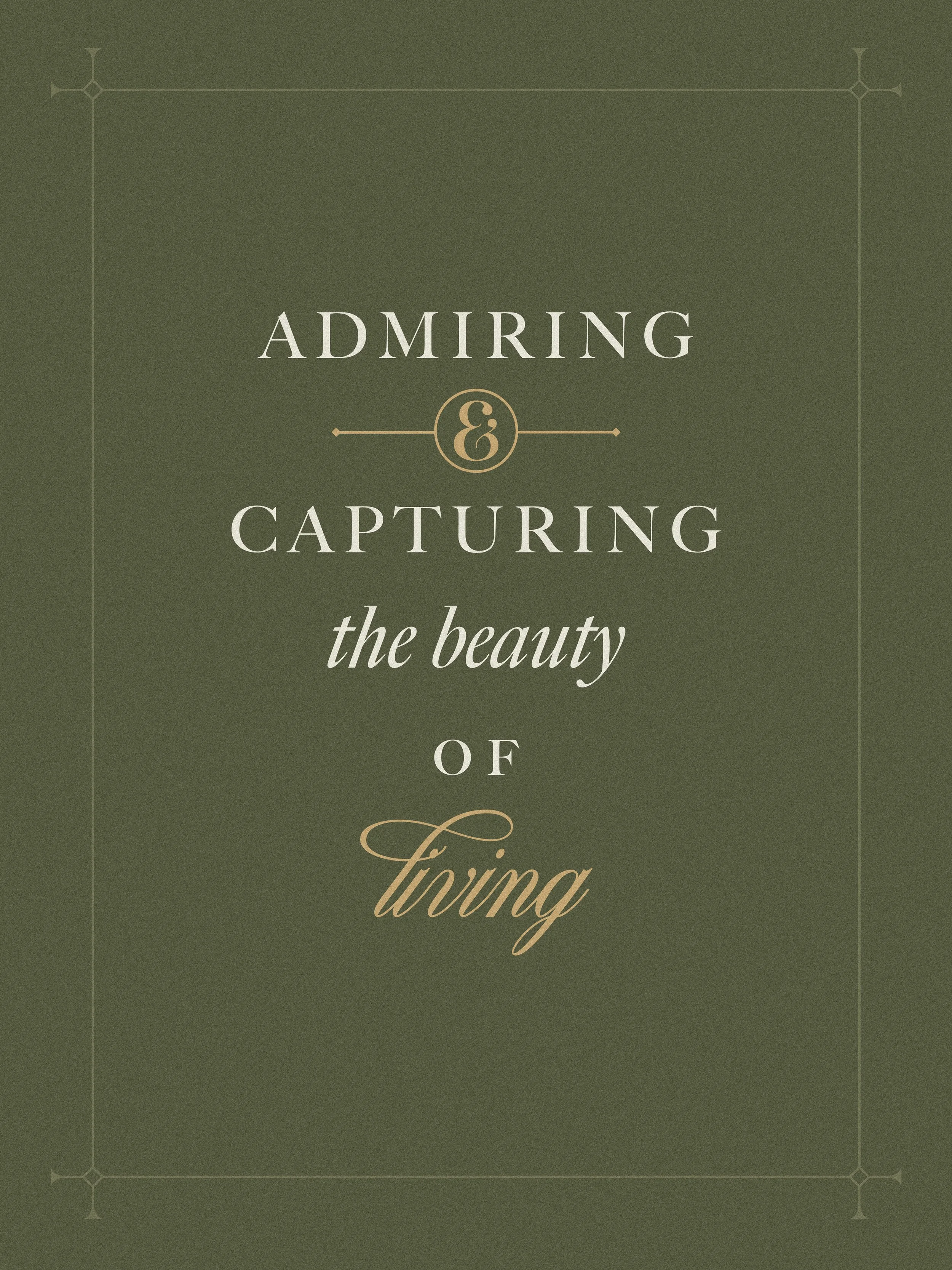
By admiring and capturing the beauty of living, I hope to invite others to see the sacred woven into the ordinary—to create moments of wonder where they might notice and behold the True God. Seek the Kingdom Creations is a passion project that hopes to reflect the Divine in the beauty around us.
CATEGORY
Branding
Logo Design
Social Media Campaign


An eye for beauty is not just a gift—it’s a vocation—a sacred participation in the role of the Creator. Artists, designers, and creatives all share in this ability to bring forth the beautiful—something that makes people stop for a moment and wonder. But, what is beauty? Where does it truly come from?
In today’s world that is tainted by a lack of peace and riddled with distraction, beauty remains as something that points towards the otherworldly. It seems as though it’s the echo of something greater that our souls thirst for. It only makes sense for God to be the one and true source of this delicacy. God is Beauty and He is revealed in all that is beautiful. We see in Romans 1:20:
“Ever since the creation of the world his eternal power and divine nature, invisible though they are, have been understood and seen through the things he has made. So they are without excuse.”
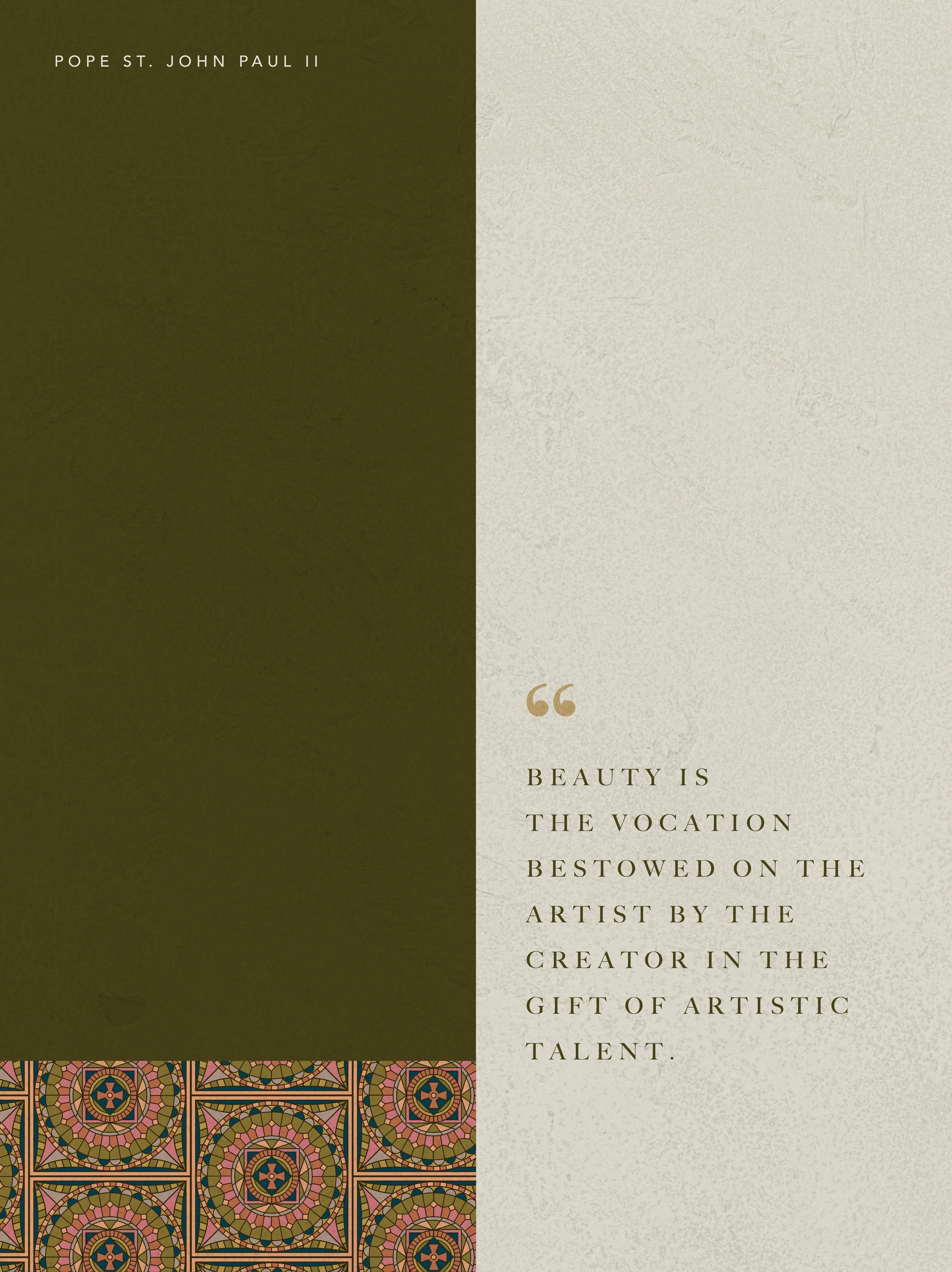
Through everything He has created, He is revealed. As a designer, someone who takes joy in this carefully and intentionally designed creation, I’ve been entrusted by the ultimate Artist and Creator with the sacred calling of reflecting and bringing this beauty to the world. In Pope St. John Paul II’s Letter to Artists he says,
“Beauty is the vocation bestowed on the artist by the Creator in the gift of artistic talent.”
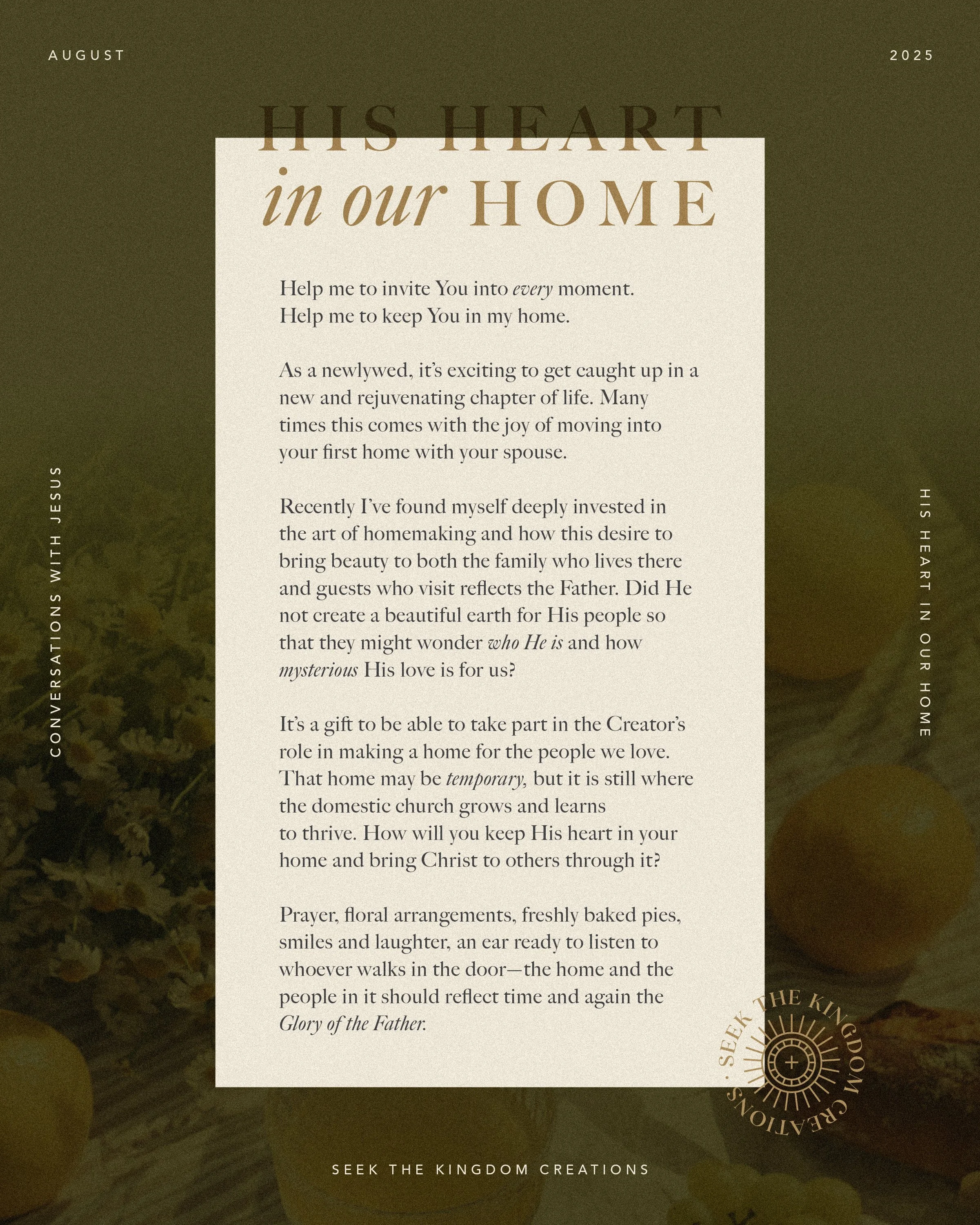
By admiring and capturing the beauty of living, I hope to invite others to see the sacred woven into the ordinary—to create moments of wonder where they might notice and behold the True God. These sacred encounters are meant for the everyday, because we all hold within us the longing for something deeper and the eyes to see wonder, if only we choose to look.


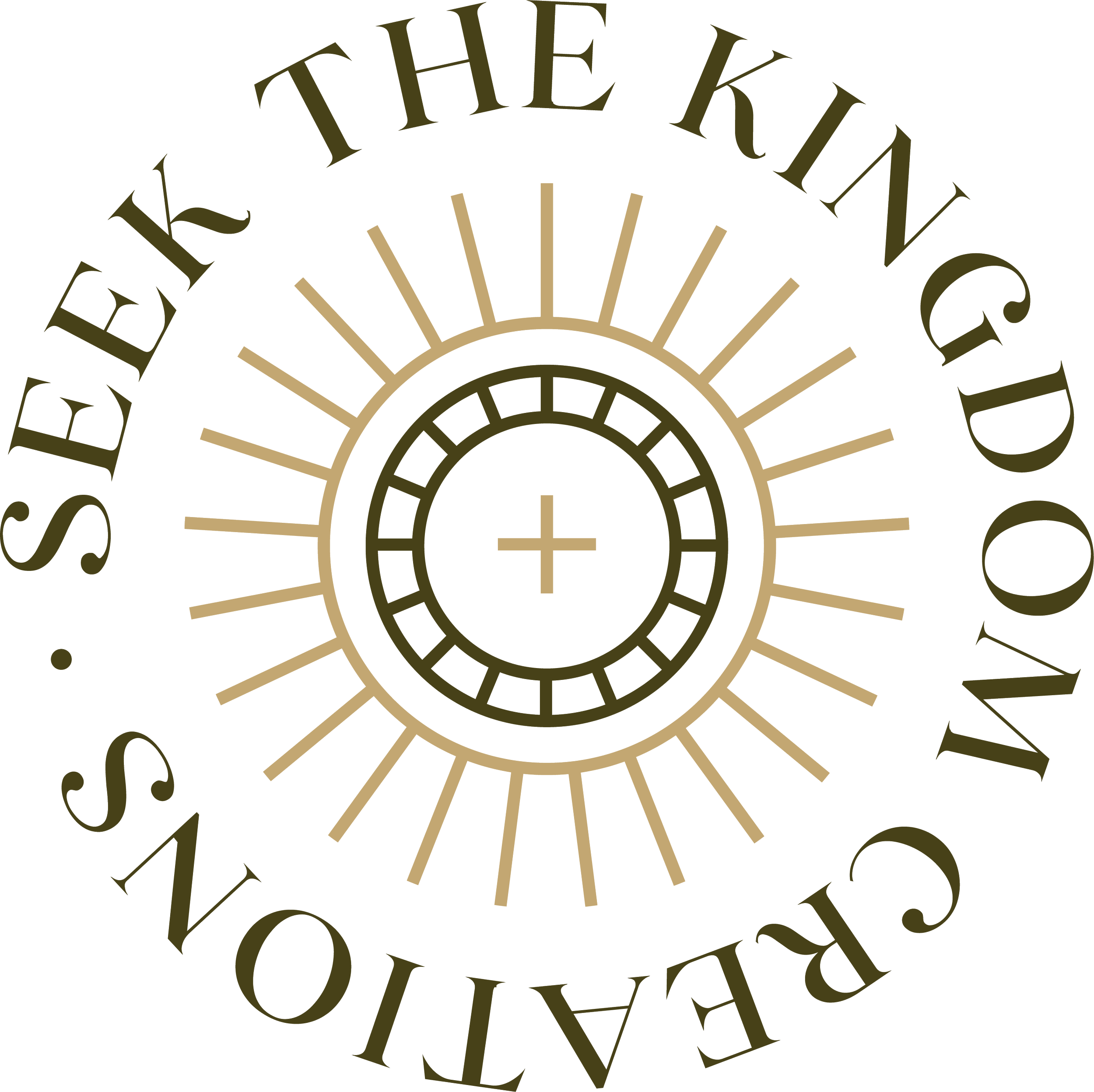
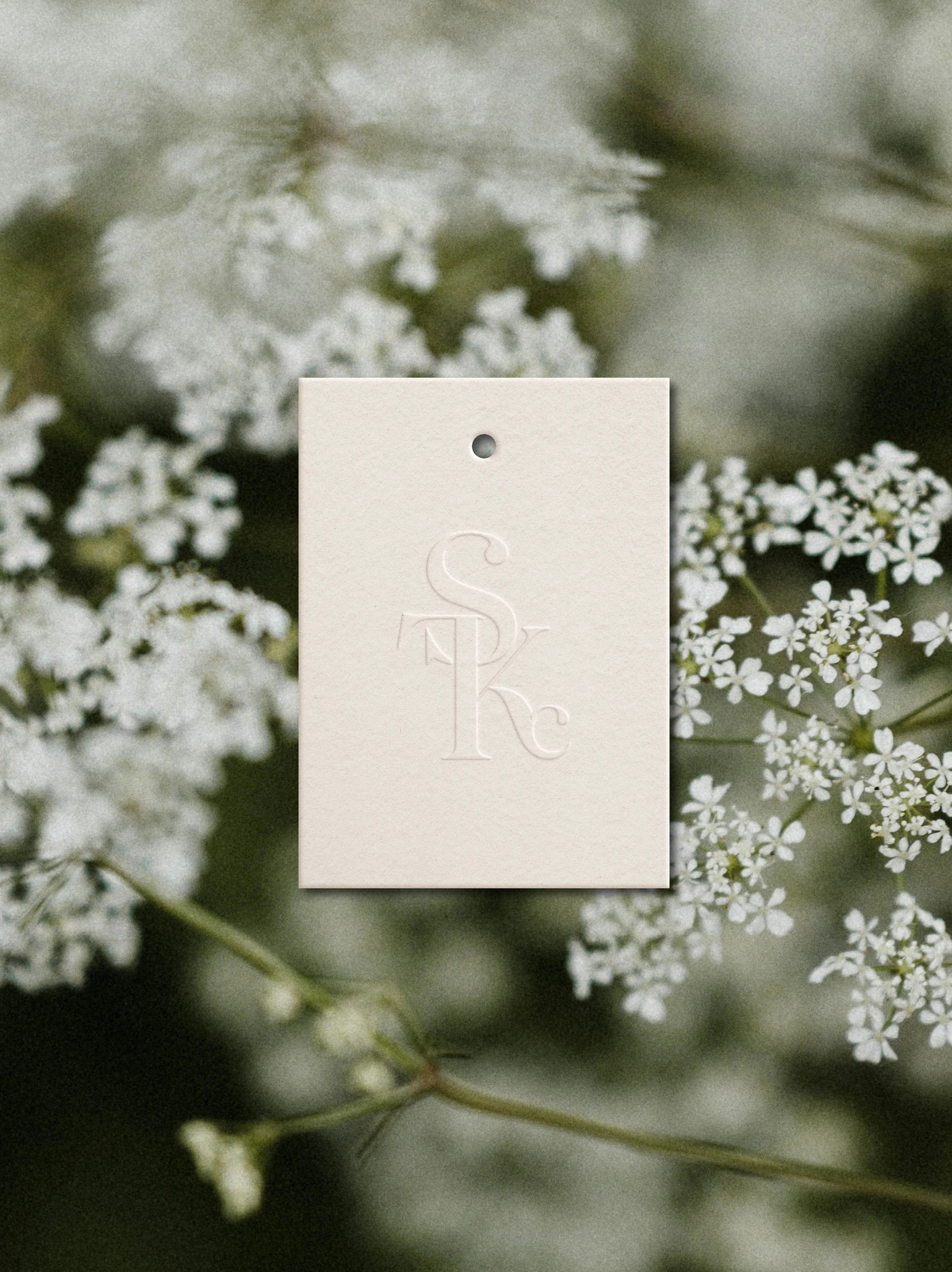
The primary logo depicts an archway with beams of light that form a cross and also take on the form of a monstrance-like shape, representing our journey of seeking to unite ourselves to Him here on earth and preparing to one day enter the Heavenly realm. This icon is situated on top of elegant serif and script typefaces. The secondary logo is a simplified version of the primary, taking the form of a circular shape and Eucharistic-like graphic in the middle with beams of light.

The color palette was intentionally chosen to bring forth a sense of earthy tones—greenery, the sky, and other natural sources. Worn Linen and Mantle Blue both hint at Our Lord and His Mother, centering the brand around the Divine. Rose was also a significant color to me because of both St. Therese’s and St. Rose’ strong intercession and impact they’ve had on my life, especially in the creative realm.


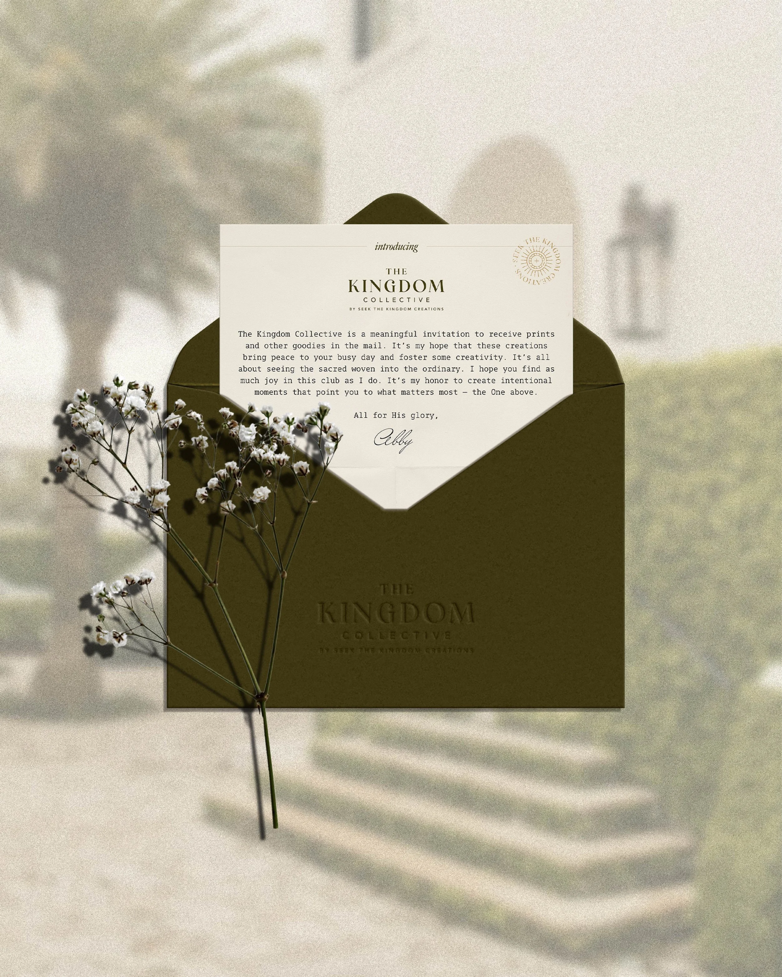
The kingDOM COLLECTIVE.
A seasonal mail club.
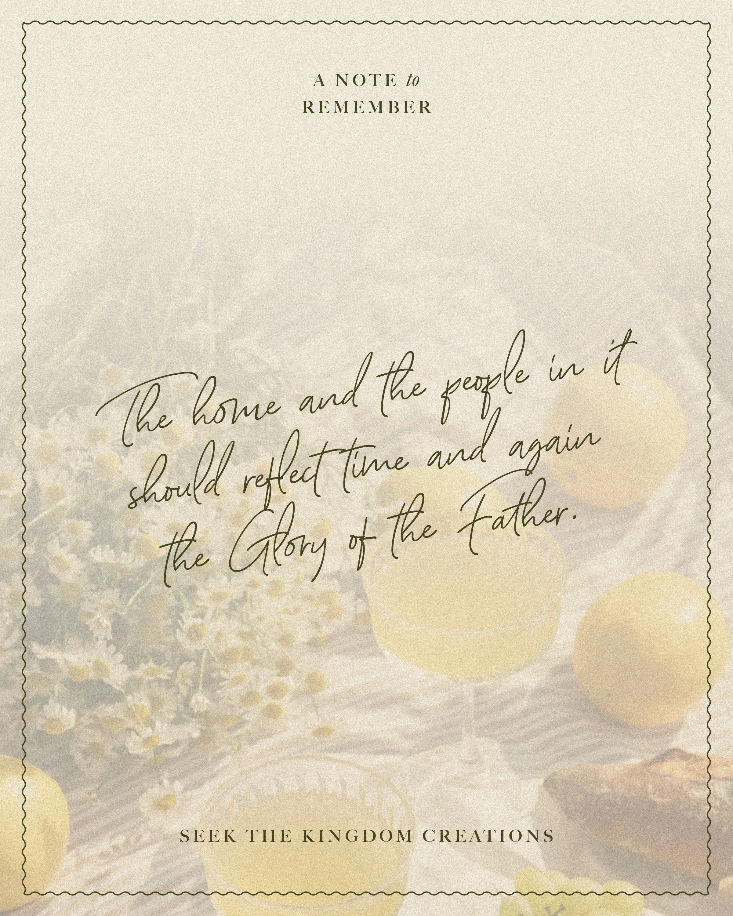
Made to lift hearts to the One above.